Square Logo
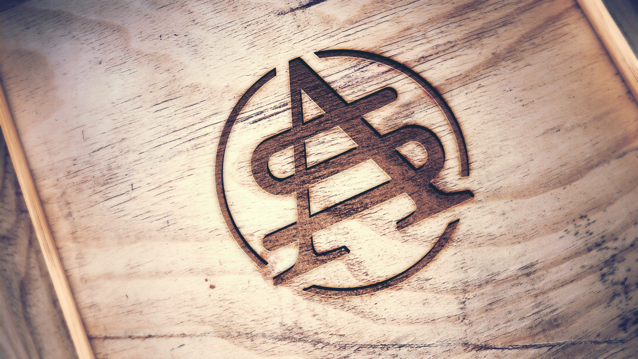
This logo and branding project was with a local woodworker, Scott Sylvester. He runs a woodworking company focused on making classic, quality wood pieces for commercial and residential use.
My favorite part of logo and branding is how collaborative the project becomes. The clients and designer come together to create a logo that's true to the designer's style as well as fitting for the company's strategy. #teamwork

Horizontal Logo
Brand Mark

Brand Colors

Font Suggestions
Dusty took the lead on this project - we knew this was going to be a more masculine brand. No script / hand lettering here, hehe. I love how clean and solid this logo turned out.
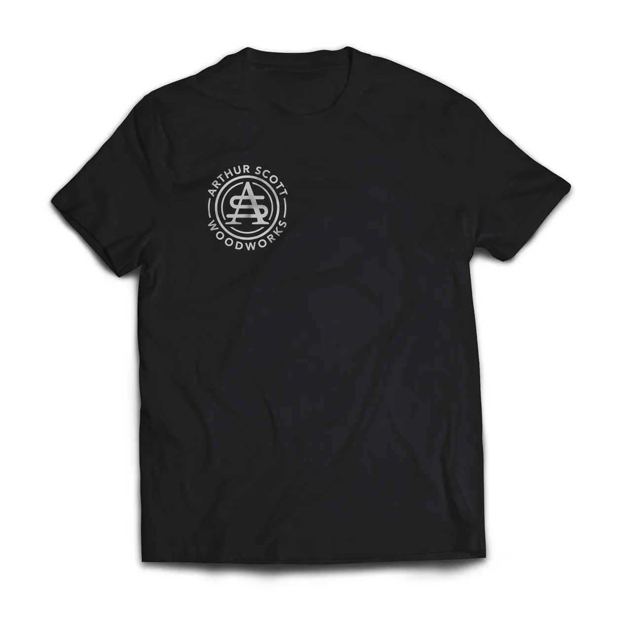
Mockup Concept of Company Tee
With three logo variations, (a primary, secondary and mark) the client can use the logo in many ways, but everything will stay unified. Excited to see this brand in action. The website is currently being design and developed. Stay tuned!
Photo 3 credit: Ashley Longworth. // We get our mockup templates here.