a simple trick to make your print project WAY better

print-design-woodstock-georgia-1.png

Imagine this scenario. The designer and the client both have a vision in their mind of the next print piece.

It is sleek.
It’s impactful.
It’s focused and effective.

The strategy meeting takes place. We’re all on board. Mood board is approved. Outline is polished. We’re ready to get started.

You send your content over to your designer and WOAH.
Hold up.

There is a huge disconnect between the vision and the reality. Suddenly your sleek print piece is crammed full of content that no potential donor is ever going to get through. There’s no longer space for the infographic you planned. Those photos? Out. The restful white space? Gone!

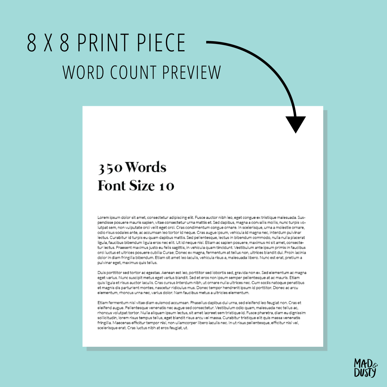
A small trick to avoiding this? Ask your designer for a look at what different word counts look like on the size piece you’re creating. This small step can save you time and make your piece more effective in the long run.

Here’s an example of a word count preview we created for Goshen Valley. This was made when we started working with them and has informed all their print pieces since.

word-count-preview-print-design-woodstock-georgia-2.png

Gathering, writing and editing the content for your project can be difficult. The word count previe will give you an idea of how much content your need for each point on your outline. If you come to a paragraph that just can’t get any shorter, no problem. You and the designer both know it may be a tight squeeze. You can consider options like adjusting some of the other pages or even adding pages.

3.png

If you’d like to talk about your print marketing, let’s chat!

Brand and Packaging Design for Etsy Maker Ordinary Mommy

branding-design-ordinary-mommy.jpg

Dusty and I are using our COVID-19 Quarantine to feature some projects we never got the chance to share. (Cobbler’s kids are the last to get shoes and graphic designer’s sites are the last to get updates. Eek!) This project was completed in 2017. It is such a great blend of our styles. Dusty’s clean, orderly aesthetic and my painterly approach.

Dusty and I had to opportunity to collaborate on this brand, Ordinary Mommy. What a dream! Our client, Faith Lex already had a brand style in place, but she needed something a little fresher.

Faith creates custom handmade decor for the modern bohemian home. When ever we hear modern, we think of good, clean design and packaging. (Those details can help justify higher prices.) Her products are top notch quality, and this new logo helped make that apparent at first glance. 

Here’s a bit about the branding process:

All of our branding projects begin with a mood board. It’s a great way to establish the overall tone for the logo and brand. Faith’s mood board is light and airy, modern boho with natural elements.

Ordinary-Mommy-Mood-Board-Preview-1.png

After the mood board is finalized, we create three logo concepts for the client.

Ordinary-Mommy-Logo-Concepts-Preview-1_Page_05.png
Ordinary-Mommy-Logo-Concepts-Preview-1_Page_07.png
Ordinary-Mommy-Logo-Concepts-Preview-1_Page_09.png

The client is asked to pick one concept to move forward with. We incorporate feedback and go to Logo Revisions Round 1. In this project, Faith went with Concept 2.

Ordinary-Mommy-Logo-Concepts-Preview-2_Page_4.png
Ordinary-Mommy-Logo-Concepts-Preview-2_Page_5.png

Then we work on another round of revisions, add color and arrive at our final logo.

Watercolor-med.png

At the end of the project, we create a brand guide book and export the logo variations (black, white, color, watercolor, and brand mark) in various easy to use formats. The brand guide book will help our client use the logo and branding effectively. It’s also a great resource for Faith if she should ever work with another creative like a product photographer or hire on employees. The guide book can help maintain the brand’s cohesiveness. If you’d like to take a look at an example brand guide, send us a message!

New Tool: Using Paperless Post for a Client's Nine Year Anniversary Party

paperless-post.gif

I was so happy to help our local yoga studio celebrate their 9th year in business! It’s really a joy to do design work for them. I love that we have our own yoga studio! It’s one of those special businesses that makes Downtown Woodstock unique.

The owner of Ember Yoga, Margaret, and I knew we wanted to do something special for their anniversary party. (9 YEARS!) Yes, we could do a Facebook event and send out an email blast… but why not do something a little special and different? My sister-in-law has been using Paperless Post’s Flyer for birthday parties. (So convenient and CUTE!) I thought we could probably apply the same ease of use and do something fun for our members at Ember Yoga.

First we designed our Flyer. We were feeling a little fancy so we went with Lucille Ball’s Champagne gif and matched it up with some over the top font choices. (The template we used was called Ritz. Check it out here!) Why not go all out, eh?

We used Flyer’s email function to email all the current members. I love that members could RSVP right from the email - and I liked that we could see who opened the invite too! There’s even a follow up feature!

It was fun and easy to use, which in my book makes it so great for both personal parties and business events. If you’re looking for a bit of a different event experience, I’d give it a shot!